

Share this tool:
Description:
Flourish is a no-code data visualization and storytelling platform built for turning spreadsheets, charts, maps, and structured data into interactive visual content. It is not a pure AI generator in the usual prompt-to-output sense. Its newer AI-adjacent value sits around smarter data setup, chart suggestions, and using AI tools alongside Flourish to clean, analyze, and prepare data. The core product is still visual storytelling: upload data, choose or receive chart suggestions, customize the result, then publish or embed it.
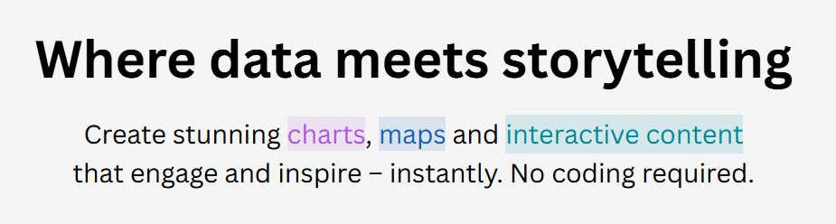
Flourish is strongest when the data is already there but the story is not. A spreadsheet can show the numbers, but it rarely guides a reader through what matters. Flourish helps bridge that gap with interactive templates, annotations, animations, maps, scrollytelling, and embeddable visuals.
The main advantage is speed without making the result look generic. Users can create charts and maps from templates, adjust the design, add captions or labels, and publish a polished visual without writing code. Flourish also supports multi-step “stories,” which are useful when one chart is not enough. These can work like data-led slide sequences or scroll-based explainers where the reader moves through a topic step by step. Flourish describes its product around interactive charts, maps, visual content, and multi-step stories.
That makes it different from standard chart tools. Flourish is less about dropping a chart into a report and more about guiding attention: show the headline trend, reveal context, zoom into a region, compare groups, then let the viewer explore.
| Feature | What it means in practice |
|---|---|
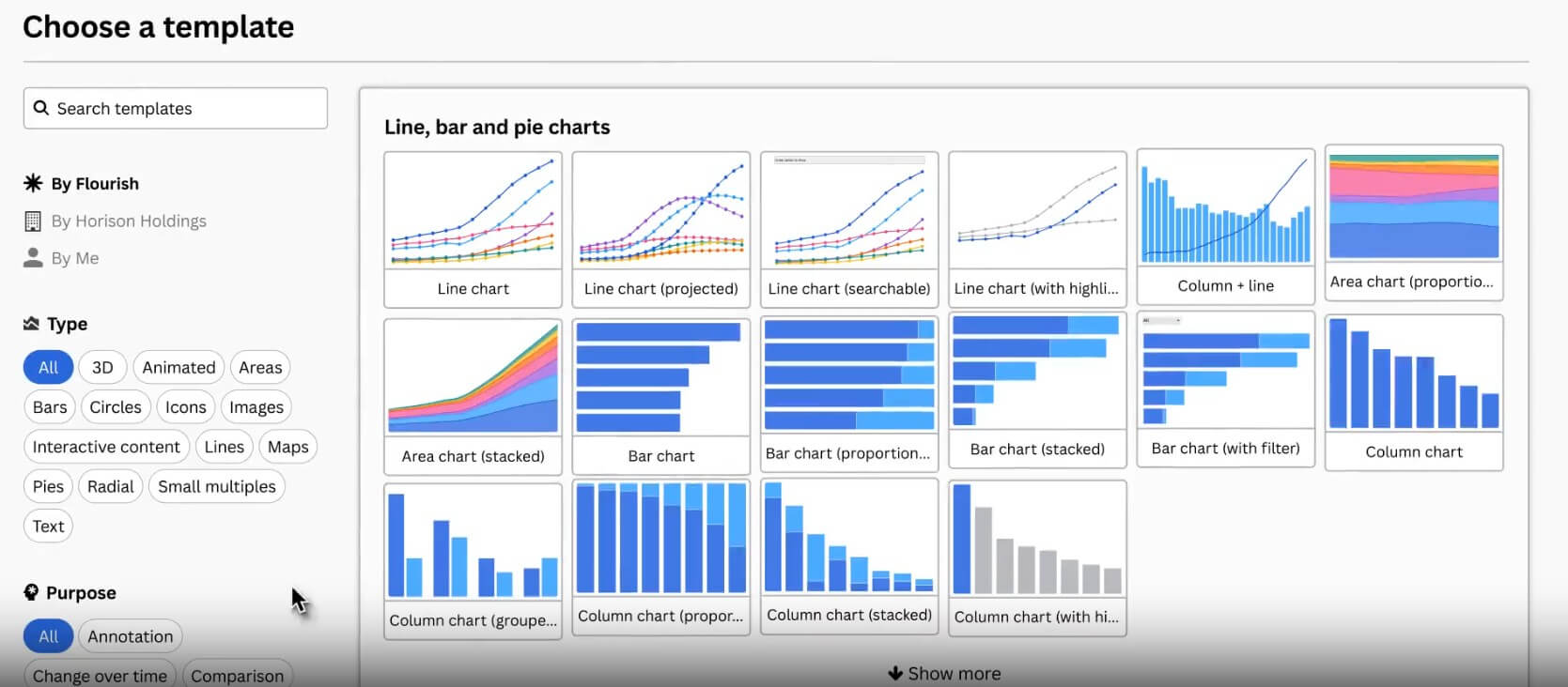
| No-code chart and map templates | Build interactive visuals without coding or design software. |
| Start with data | Upload a dataset first and let Flourish suggest suitable chart types based on the data structure. |
| Flourish Stories | Combine visuals, captions, transitions, and narrative steps into a guided explainer. |
| Scrollytelling | Turn charts into scroll-driven stories where each step reveals one point at a time. |
| Data Explorer | Let users explore multiple metrics, views, filters, and map/chart formats from one dataset. |
| Embed and publish options | Share interactive charts on websites, reports, and editorial pages. |
Flourish should not be reviewed as a chatbot-style AI tool. It does not mainly depend on typing prompts and waiting for a full chart to appear. The more accurate way to describe it is a data storytelling platform with AI-assisted workflow support.
The most important AI-adjacent feature is Start with data, introduced as a beta workflow in 2025. Instead of asking users to pick a template first, Flourish can analyze the uploaded dataset with pattern matching and scoring algorithms, then suggest chart types that fit the structure. It can also handle some basic data formatting behind the scenes. That is useful because many users struggle before they even start: they do not know whether their data should be a map, line chart, bar chart, grid, table, or small multiples view.
Flourish also publishes guidance on using chat-based AI tools such as ChatGPT, Claude, and Gemini around the chartmaking process. The suggested workflow includes finding data, analyzing patterns, cleaning datasets, choosing chart types, formatting data for Flourish, and polishing the final chart. That is a practical use of AI, but it sits around the product rather than replacing the editor.
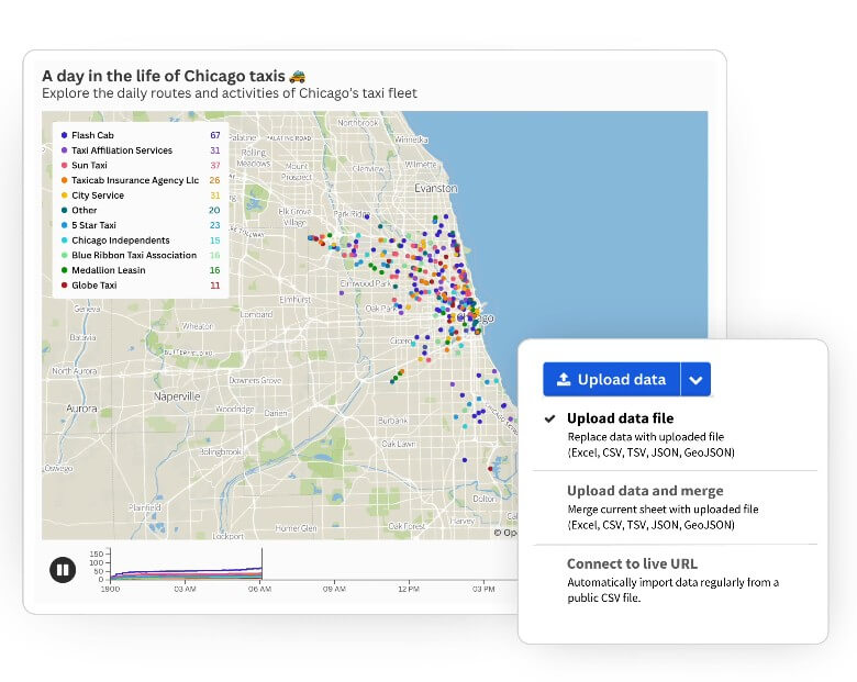
The normal Flourish workflow is straightforward: start with a template or dataset, upload or paste data, check how columns map to visual elements, adjust the design, add interactivity, then publish or embed.
The smoother workflow is “Start with data,” because it reduces the first big decision. Rather than asking beginners to understand chart taxonomy, Flourish can suggest chart types after looking at the dataset. That makes the tool feel more approachable for marketers, educators, nonprofit teams, and journalists who need a good visual but do not want to become data visualization specialists.
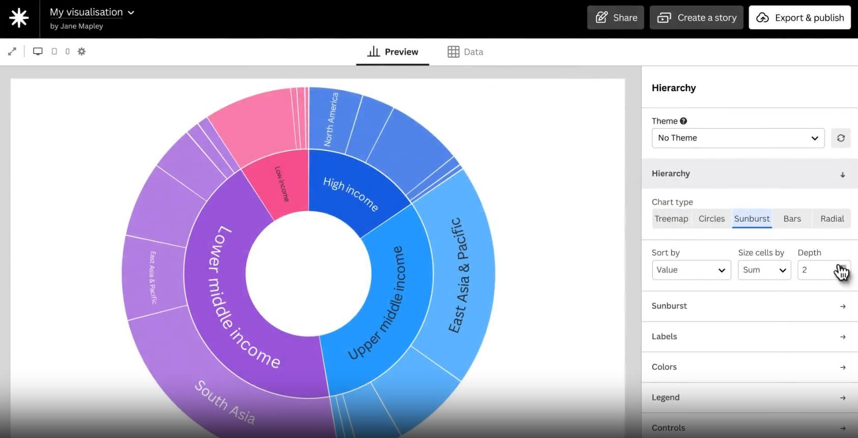
There is still a learning curve. The editor is friendly, but data structure matters. A messy spreadsheet can still create a messy visualization. Users need to understand rows, columns, categories, dates, and values well enough to prepare the data properly. Flourish can help with automatic column selection and data type interpretation, but it cannot fix a weak story or an unreliable dataset on its own. Flourish says its automatic column selection can interpret column types and choose suitable columns for many templates, while still allowing users to override settings when needed.
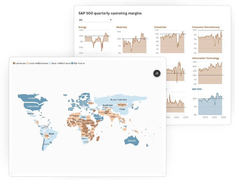
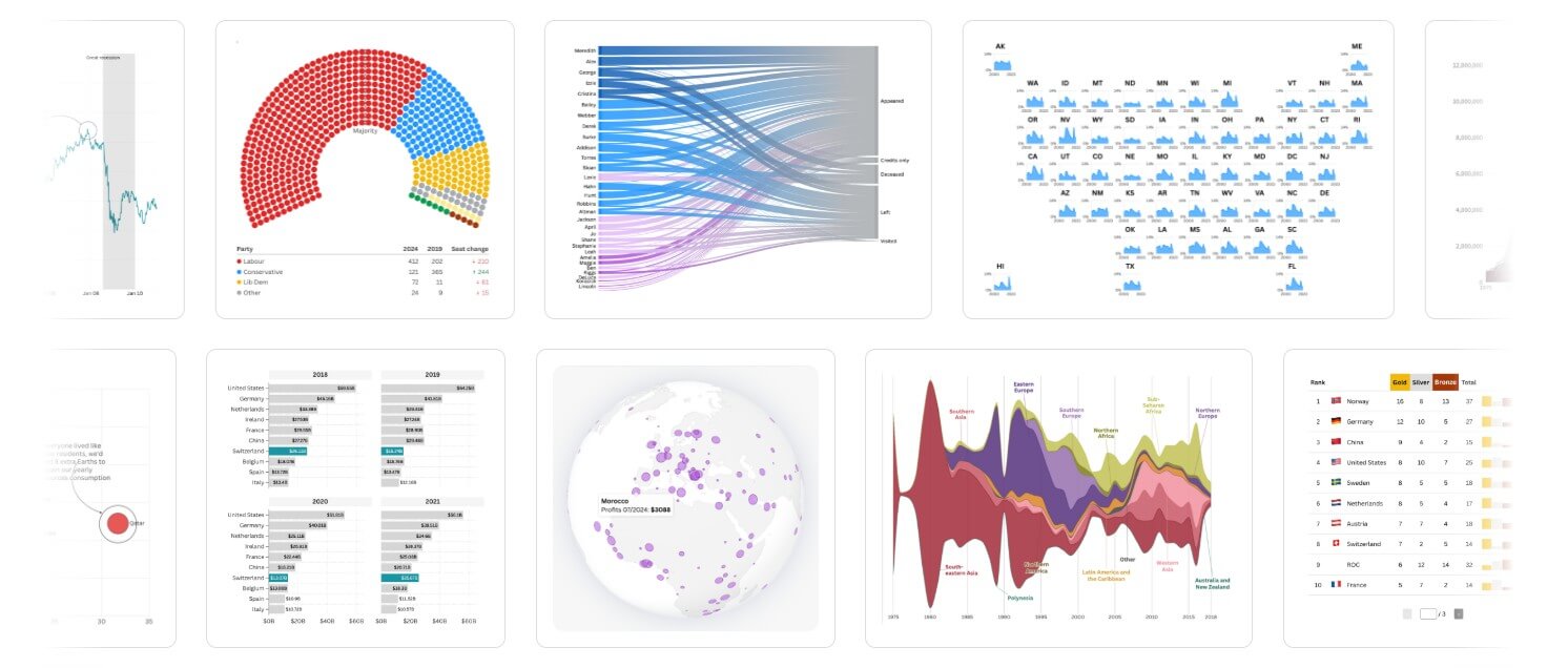
Flourish’s biggest quality advantage is that its templates are made for public-facing visuals, not just internal dashboards. The results can look polished enough for journalism, marketing, education, research communication, nonprofit reporting, and business storytelling.
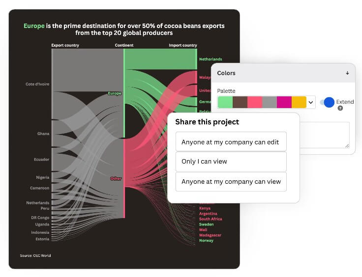
The control level is good for a no-code tool. Users can adjust colors, labels, annotations, popups, filters, map views, chart states, captions, and transitions. The better templates do more than display values; they help guide the viewer through a comparison or change over time.
Scrollytelling is one of the stronger examples. Instead of showing a dense chart all at once, the story can reveal one insight per scroll step. Flourish’s own scrollytelling guidance emphasizes that charts can animate, filter, zoom, or transition between views as the reader moves through the page.
The limitation is that template-based tools always have boundaries. If you want a visual experience that behaves in a highly custom way, Flourish may feel constrained unless you have developer support or use more advanced customization routes.
Newsrooms and editorial teams: Elections, polling, sports rankings, public data, timelines, financial charts, and explainers.
Marketing and communications teams: Campaign reports, audience insights, survey results, annual reports, and thought leadership pieces.
Education and nonprofits: Public-facing impact reports, maps, inequality data, funding breakdowns, and awareness campaigns.
Business analysts: Executive-ready visuals that are easier to share than spreadsheet screenshots.
Researchers and data communicators: Interactive explainers where readers need context, not just raw numbers. It is less suited to private business intelligence, heavy internal analytics, or teams that mainly need database querying, role-based dashboards, or automated reporting pipelines.
- Start with the story, not the chart. Decide what the reader should notice first, then choose the template that supports that point.
- Clean the dataset before uploading. Flourish can help with column recognition, but clean columns, consistent labels, and clear date formats still matter.
- Use annotations sparingly. A few strong labels can guide attention better than decorating every point.
- Try Start with data when you are unsure which chart fits. It is most helpful at the beginning, when the wrong chart choice can waste time.
- Use scrollytelling for complex topics. If the chart needs three paragraphs of explanation, it may work better as a guided story.
Flourish is not a full AI chart generator, so users expecting “type a prompt, get a finished data story” may be disappointed. The AI layer helps around the workflow, but the user still needs to supply data, check accuracy, refine the visual, and shape the story.
The second limitation is data preparation. Flourish makes visualization easier, not data work effortless. Bad source data, unclear column names, missing context, or poor structure can still slow the project down.
The third trade-off is template dependency. Templates are the reason Flourish is fast, but they also set the boundaries. Most users will be happy with those boundaries. Advanced designers or developers may want more control than the standard editor gives.
Flourish is best for people who need to turn data into clear, interactive stories without building charts from scratch. Its strengths are polished templates, guided storytelling, scrollytelling, map support, data exploration, and smarter setup through features like Start with data. It is best for journalists, marketers, educators, nonprofits, and communication teams that publish data for real audiences. The main caveat: Flourish helps you present and explain data well, but it does not remove the need for clean data, editorial judgment, and careful fact-checking.
TAGS: Productivity
Related Tools:

AI-powered data analysis platform

Enhances productivity for researchers

Provides real-time transcription for meetings and conversations

Automates web tasks

Simplifies creation of educational content

Quickly summarizes lengthy text by extracting key points