
Share this tool:
 |
Description:
GraphicInfo is an AI infographic generator for turning information into designed visual stories. Instead of starting with a blank canvas, you explain the subject, provide the key facts, choose a format, and let its design agent construct the infographic. The result remains editable, so you can revise it through chat or change individual elements yourself.
The key difference from using a general AI image generator is structure. GraphicInfo creates the infographic as HTML and CSS rather than giving you only a flattened AI image. That makes text, layout, positioning, colors, and other elements easier to correct after generation.
GraphicInfo works best when you treat the prompt as a design brief rather than an image prompt. Here are copy-ready prompts to try.
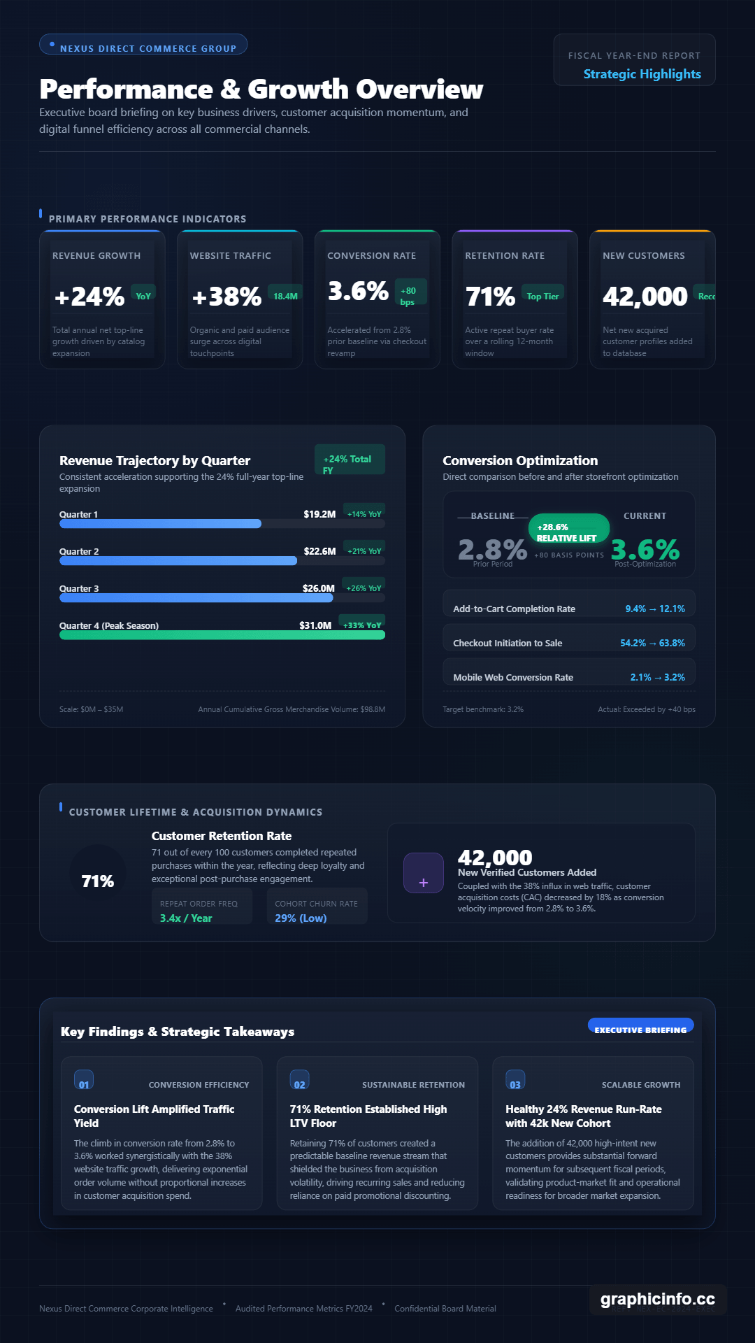
“Create a professional landscape infographic showing the performance of an imaginary e-commerce company. Include revenue growth of 24%, website traffic growth of 38%, conversion rate increasing from 2.8% to 3.6%, customer retention of 71%, and 42,000 new customers. Use KPI cards, a bar chart, a conversion comparison, and a short section highlighting the three most important findings. Keep the design clean and suitable for an executive report.”
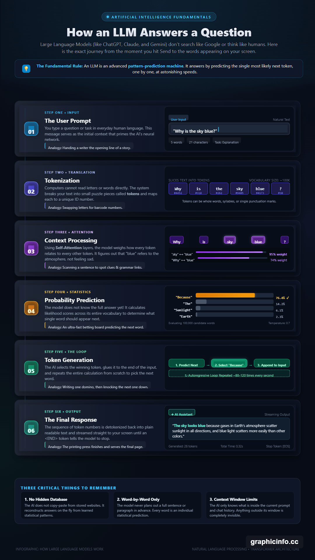
“Create a vertical educational infographic explaining how a large language model answers a question. Show six stages: user prompt, tokenization, context processing, probability prediction, token generation, and final response. Use a connected visual flow with short explanations, simple diagrams, and clear labels. Make it understandable to someone with no technical background.”
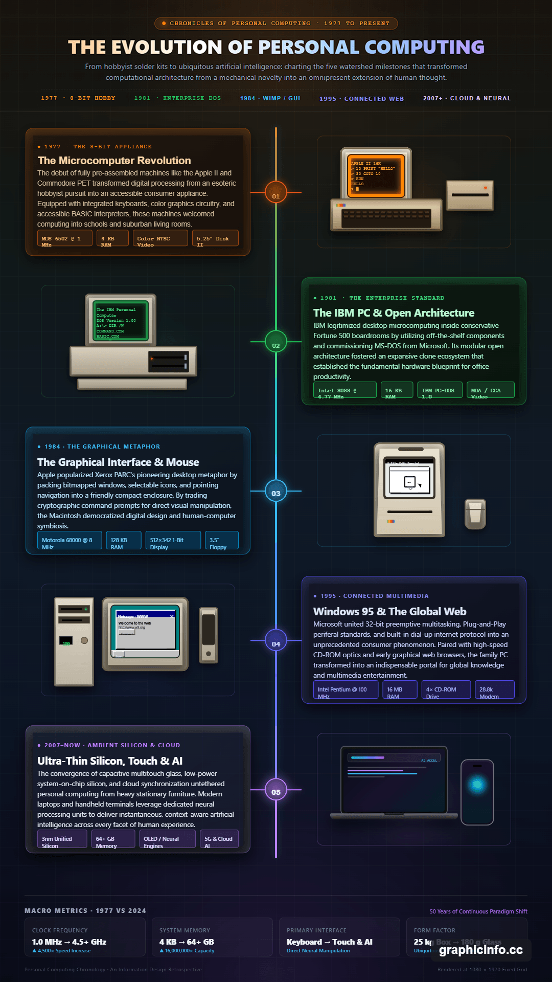
“Create a vertical timeline infographic showing major milestones in the history of personal computing. Organize the information chronologically with a clear visual path. Give each milestone a short heading, two-sentence explanation, and relevant illustration. Use a retro technology aesthetic that gradually becomes more modern toward the bottom.”
That gives the system several things to work with: the subject, information hierarchy, intended structure, source material, and visual direction.
You can also attach images or text references and mention them in your instructions. GraphicInfo then uses those materials when building the design.
This reference workflow is particularly useful when the infographic needs to summarize existing research, company data, educational notes, or other material rather than invent content from a broad topic.
Not every infographic should look or read the same way. GraphicInfo addresses this with six specialized design skills.
| Skill | What it focuses on |
|---|---|
| Editorial | Strong typography and magazine-style visual hierarchy |
| Data report | Charts, KPIs, comparisons, and evidence |
| Timeline | Chronological events, milestones, phases, and processes |
| Comparison | Side-by-side choices and trade-offs |
| Explainer | Clear educational treatment of complicated subjects |
| Social post | Short, bold information designed for quick reading |
These modes are more useful than a generic list of visual styles because they change how information should be organized.
A timeline needs chronological flow. A data report needs numbers to carry more visual weight. An explainer needs to make a difficult idea easier to follow. Choosing the right skill gives the AI more context about what the design needs to accomplish.
The first generation doesn't have to be the final design.
GraphicInfo keeps the AI agent available after the infographic has been created. You can ask it to rewrite text, change the visual direction, reorganize sections, simplify the design, or add visual material.
This makes follow-up instructions such as “make this more editorial,” “shorten the third section,” or “give the conclusion more visual emphasis” practical.
That iterative workflow matters for infographics because small changes can affect the whole composition. Shortening a paragraph creates empty space. Adding another statistic may require a different hierarchy. Chat-based revision lets the system reconsider those relationships instead of making you rebuild the page manually.
GraphicInfo doesn't force every change through a prompt.
Its visual canvas lets you select elements and directly change text, typography, colors, size, position, and layer order. Undo and redo controls are also available in the editor.
This is one of the platform's stronger ideas. AI is useful for creating the initial composition or making broad revisions. Manual controls are faster when the problem is something small, such as moving a heading, correcting a label, or adjusting the size of an element.
The combination makes GraphicInfo feel closer to an AI-assisted design environment than a one-click infographic generator.
GraphicInfo supports three main canvas formats: 9:16 portrait, 16:9 landscape, and 1:1 square.
Those formats cover several practical destinations. Portrait works well for long-form social graphics and mobile content. Landscape suits presentations and wider reports, while square is useful for compact social posts.
Finished designs can be exported as PNG, JPEG, or WebP files.
GraphicInfo makes the most sense when the source material is already valuable but difficult to scan.
Business reports can turn KPIs and comparisons into a more readable visual summary. Educators can use the Explainer or Timeline skills for lessons and processes. Marketers can turn research, product comparisons, or campaign data into shareable content. Researchers and writers can use references to convert dense information into a visual overview.
It is also useful for social content when the goal is communicating information rather than generating decorative imagery.
GraphicInfo is specialized around infographics, so it isn't a replacement for a broad graphic design suite. Users building presentations, detailed illustrations, complex brand systems, or large multi-page documents will need other tools.
The more important limitation is factual reliability. GraphicInfo states that AI output can be inaccurate, incomplete, or outdated. Users are responsible for reviewing facts, labels, calculations, and rights before publishing the result.
Sensitive source material also deserves caution. GraphicInfo says prompts and relevant project content may be sent to third-party AI providers, and uploaded project assets may be delivered through public content-delivery URLs. Its privacy guidance therefore advises against uploading confidential, regulated, or highly sensitive information.
GraphicInfo is most useful when you have information first and need design second. Give it the facts and direction, let the AI establish the visual structure, then use chat or the canvas to correct and refine the result.
It is a good fit for marketers, educators, researchers, business teams, and content creators who regularly turn dense information into visual communication. Its main caveat is that good design doesn't guarantee correct information. The editing tools can help polish the infographic, but facts and data still need a human check before publication.
TAGS: Generative Art
Related Tools:
Generates unique anime-style artwork

AI tool for animating paintings
Create and blend Images
Generates unique artworks from prompts

Enhances digital media

Creates optimized, high-converting video thumbnails